One thing we can conclude at the beginning is that the only constant thing in web development is change – trends in web development are constantly changing. As time passes technical possibilities in web development are endless, and designers need to be able to use them all going from one extreme to another while deconstructing previous trends and try their best to bring out something new b experimenting. At the same time, some trends have been present for a while and will remain unchanged for a while longer. For example, minimal and multicolor illustrations.
Before we continue going through the future trends it’s important to understand that most of them are not new. But what is new about them is the fact that they can no longer be ignored. Some have withstood the test of time only because they turned into a necessity for maintaining quality online user experience and development of web pages.
According to website, a lot of web development trends we are already familiar with will continue this year and well after 2024. Primarily because of their educational nature, responding to specific questions, and also for providing a quality experience to their users.
Having all that was written in mind, let’s explore the future web development trends to keep an eye on in 2024.
1. Dark mode

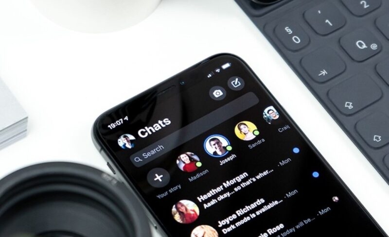
Asking whether or not you’re using social networks is unnecessary, you are already familiar with this trend if you’re even at one of them. Many websites, seeing how popular ‘dark mode‘ is becoming, decided to place their content on the black background.
It is believed that this is the leading trend in 2024, giving users the option to include a ‘dark’ theme. The dark or black background is ideal for highlighting the designed elements, which achieves a high degree of contrast, with the help of using a wider range of colors.
Another fact makes this browsing mode desirable. The ‘dark mode’ is much better for the user’s eyesight than the shiny white background, to which we have been exposed so far. Given the fact that some of our work on computers sometimes for more than 8 hours, with additional exposure to blue light on mobile phones and similar electronic devices, we should do all this in the dark mode browsing, in order to minimize damage to our eyesight.
With this mode, very dynamic design is achieved, which allows the user to see all the elements and colors on the screen as well as possible while perceiving them in their full spectrum. Besides, mobile phones need significantly less energy to display the dark mode of site browsing than is the case with light or white backgrounds.
2. 3D elements

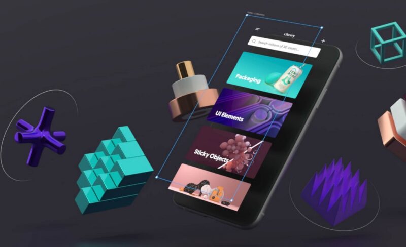
The use of 3D technology in graphic design is expected to increase this year. Technology pushes the boundaries in design but the design also does it in the opposite direction. Designers strive to incorporate all of our senses and previous experiences into a unique experience of accessing a particular interactive website, where many elements float through imaginary space.
3D models and design have always delighted users, but what kept designers away from them were the prices and insufficient development of technology, which could support all their ideas. However, the development of technology is now at a high level and this allows designers to use it more and more, to create a hyper-realistic 3D design across the entire screen, which will attract the attention of site visitors and keep it on it as long as possible. Until VR becomes more affordable, this is a great way to create a quality immersive experience on the site.
3. Chatbots

It is predicted that almost all consumer interactions in the very near future will be conducted exclusively through chatbot technology, not involving human agents. Why? Because people expect to be able to get in touch with the company 24/7.
Fortunately, chatbots can refer people to specific sites to complete desired actions, such as booking a consultation. While there are some limitations on how much they can improve a conversation, the need for instant gratification and more realistic interactions will only encourage further progress.
Whether people lead hectic lives, have extremely demanding jobs, or simply expect answers when they want them, as professional businesses, your job is to provide answers as best and as quickly as possible. If you don’t, your competitors certainly will. So, following web development trends is of great importance to your business development.
4. Combining photography and graphics

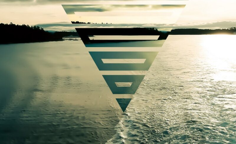
Using photos in combination with illustrations or graphic elements, helps brands send a very personalized message to customers or users of their services. Whether it’s photos of people or products, these displays will help the branding and the site itself stand out from the competition.
Creativity can be pointed out, when, for example, graphic elements are placed over photographs, which together form a kind of a digital collage. The technology or financial sector may be particularly interested in this kind of web design because in this way they can make figures, graphs, and similar representations of statistics interesting and playful.
5. Imperfection gives a personal touch

Imperfect, hand-written or drawn elements and fonts, give a personal touch to the design, but also a human note to the sites, which for years had that too perfect cyber look, deprived of any warmth and humanity. It turned out that this is exactly the trend that users like, very popular in 2024 because it brings them the message that nothing has to be perfect but only deeply personal and conspicuously authentic.
Brands especially like this trend because they can give their product a unique identity, which will help them to connect with customers on a higher emotional level and provoke positive emotions in them.
Apart from the five trends, we were able to predict, here will for sure be many more that will surprise us with their uniqueness. The web technology is developing ultra-fast, and therefore, we can expect the unexpected.
 Comeau Computing Tech Magazine 2024


